Family Memory Apps With Real Visual Design
Most family memory apps look functional. A few look cinematic. If you're giving an archive as a gift — or building one for grandchildren who haven't been born yet — the design quality matters more than the feature checklist.
Patrick Moore, Founder • May 10, 2026
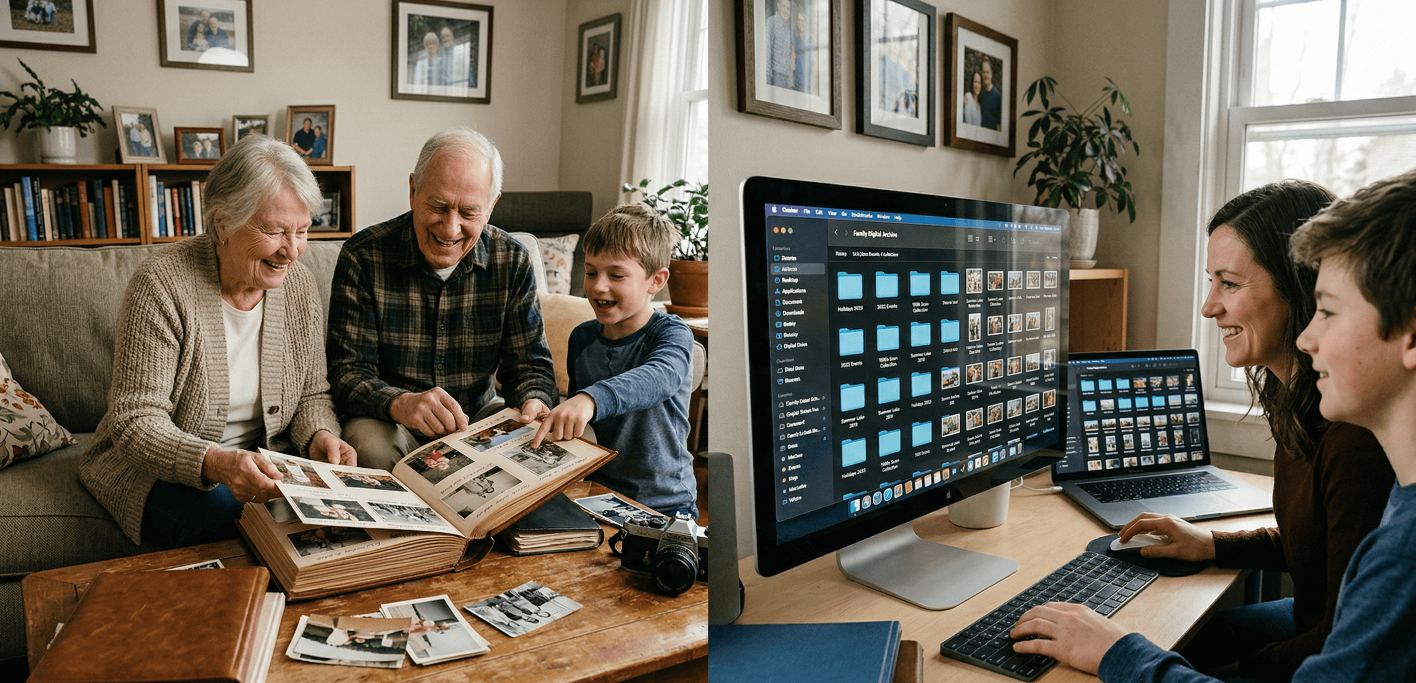
Open most family-memory apps for the first time and the immediate impression is spreadsheet. Rows of date-stamped photos. Generic stock-template UI. The same gradient-blue header you've seen on a hundred SaaS dashboards. The product works — but it doesn't feel like the place a family's history should live.
This is a real problem most reviews don't address. The design quality of a family-memory app is not just an aesthetic preference. It's the difference between an archive your kids will return to and an archive that gets opened twice a year. People don't curate, gift, or recommend tools that look like work software. They curate the things that feel like belongings.
This post is the honest survey of which family-memory apps actually look premium — and which ones rely on stock-template design and hope you won't notice.
Six things that separate cinematic-feeling apps from spreadsheet-feeling apps
There's no single feature that makes an app feel cinematic. It's a stack of choices that compound. Some specific things to look for:
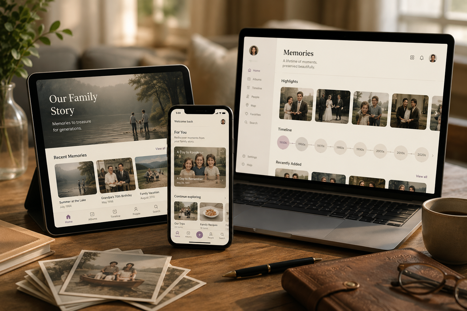
1. Real typography, not the default. Most family-memory apps use the same sans-serif (Inter, SF Pro, generic system fonts). A cinematic-feeling app pairs a serif display font (Playfair Display, Cormorant, Tiempos) with a humanist body font. The pairing immediately signals that someone made a typography decision rather than accepting the default.
2. Visual hierarchy that respects the content. Photos are framed properly with breathing room, not crammed into a uniform grid. Stories sit alongside their photos with intentional layout, not auto-template. Voice recordings have their own visual language (waveforms, audio cards) rather than being represented as generic "play" buttons.
3. Density that matches the medium. Family memories aren't documents — they're heirlooms. A cinematic-feeling app uses lower information density, more whitespace, and larger imagery than a productivity tool would. The interface invites browsing, not skimming.
4. Color that's actually thought about. Most apps default to a primary brand color and call it a day. Cinematic apps consider how color reads alongside family photos (warm, neutral, restrained palettes work; saturated brand colors fight with the imagery). They consider light vs dark mode. They consider what the interface looks like when it's holding a black-and-white photo from 1973.
5. Motion that's restrained. Cheap apps use heavy motion (flashy transitions, parallax, animated gradients). Premium apps use restraint — subtle hover states, considered fade transitions, no motion that competes with the content. Family memories don't need to entertain; they need to be present.
6. The small details that nobody asks about. Loading states that match the brand. Empty states that don't apologize. Print-fidelity rendering. Considered defaults when the user hasn't filled in metadata. These are the choices nobody notices individually and everyone feels collectively.
A cinematic app gets most of these right. A spreadsheet app gets most of them wrong, often without realizing the design decisions matter at all.
Which family-memory apps actually look premium
A short tour of the category from a design-quality angle. We're skipping feature comparison here — the comparison of the best family archive apps covers that. This is purely the visual-design read.
Memory Murals. Full disclosure: this is our product. We pair Playfair Display (display headings) with PT Sans (body), restrain motion deliberately, and built the visual language around photographs of real families rather than stock SaaS imagery. Whether we've succeeded is up to the reader; we've at least made the design choices on purpose. Brand color is a restrained purple-violet that doesn't fight family photos.
StoryWorth. Cleaner than most direct competitors. Recent redesign moved the reading experience closer to a magazine layout, with serif body type and image-led storytelling. The book-deliverable side is genuinely well-designed — the printed books look like real books, not vanity press. The web reading experience hasn't quite caught up to the book quality, but the brand identity is consistent and intentional.
Remento. Strong product design overall. Clean recording flow, considered typography, and the printed memoir books are well-bound and well-typeset. The mobile app feels modern. Brand identity is restrained green-and-cream which works alongside family photos better than most.
Heirloom (heirloom.cloud). Built around polished memory videos. Visual quality is genuinely high — the cinematic edit-and-music output is the brand's whole pitch. The trade-off is that the deliverable is a finished video rather than an ongoing archive; for the moments when polished video is the goal, the design quality is best-in-category. See Memory Murals vs Heirloom for when each fits.
Tinybeans. Functional but undistinguished. Generic feed UI with timeline-style cards. Design is reasonable, but it doesn't communicate "heirloom" — it communicates "private Instagram for kids." Which is the brand's actual goal, but if you want an archive that feels gift-worthy or premium, Tinybeans isn't the visual fit.
FamilyAlbum. Similar story to Tinybeans. Clean, simple, but unmistakably feed-shaped rather than archive-shaped. Strong execution on its design goals; those goals just aren't "this should feel like an heirloom."
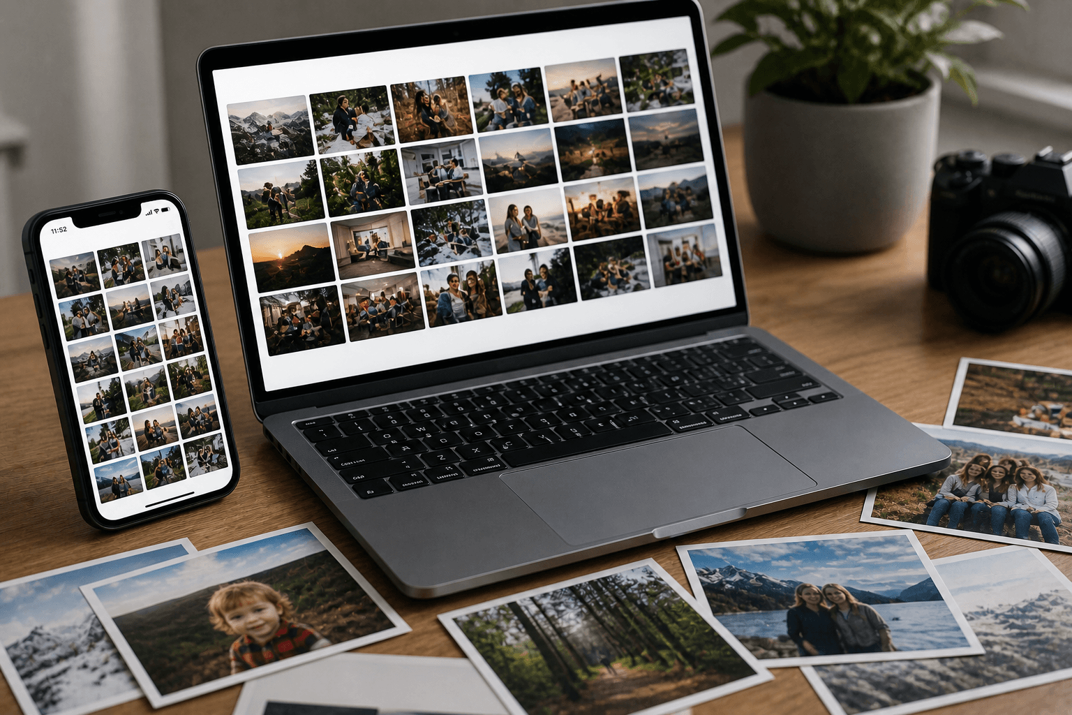
Google Photos / Apple Photos. These are the spreadsheet-feeling end of the spectrum. Excellent at photo storage, but the interface treats every photo identically — no place for a story, no consideration of how a 1973 black-and-white photo should be framed differently from a 2024 iPhone burst. Functional design, not heirloom design.
Most memorial-platform tools (ForeverMissed, etc.). Mixed. Some have genuinely thoughtful design (Chptr, for instance, leans modern and considered). Others show their age — functional but visibly dated UIs that haven't been refreshed in five-plus years. Worth looking at the actual product before assuming the category is uniformly polished.
When design quality is decisive
For some families, design is purely a preference. For others, it's decisive. A few specific situations where the visual quality of the tool tips the choice:
As a gift. A family archive given as a gift — for an 80th birthday, a wedding, a celebration of life — needs to feel like a gift. Spreadsheet-feeling tools don't make the cut at this level. The recipient opens the link, sees the interface, and either does or doesn't feel like the giver put thought into the choice. The design quality is the gift-reveal moment.
For grandchildren who haven't been born yet. The archive is going to be opened in 2050 by people who haven't been born in 2026. Whatever they encounter then is going to shape how they relate to the family's history. Design quality compounds over time — a beautifully-designed archive feels meaningful at fifty years; a spreadsheet archive feels archaeological.
For families who care about aesthetics in general. Some families have houses full of art, considered furniture, books on the shelves. The archive is a continuation of that household. A tool that doesn't match the household aesthetic feels foreign no matter how feature-complete it is.
For documentary or heirloom intent. When the project is explicitly to create something heirloom-quality, the design of the container matters as much as the content inside it. Heritage projects, biography-style archives, and specifically-curated collections benefit disproportionately from premium-feeling tools.
For most other use cases — daily kid-photo updates, casual photo backup — design quality is a nice-to-have. For the use cases above, it's the deciding factor.
What you trade away for premium design
Honest note: premium-feeling tools are usually slower to ship features than functional-first competitors. The visual-design overhead is real. Some specific trade-offs to expect:
Smaller feature library. Premium-design teams ship fewer features per quarter. Tinybeans has more features than Memory Murals; Memory Murals has more design care. Pick which one matters more for your project.
Slightly steeper learning curve. Restrained UIs sometimes hide common actions in favor of cleaner interfaces. Functional-first tools surface every option immediately; premium tools hide them behind hover states or progressive disclosure. Most users adapt within minutes; the first impression can feel "where's the button" until they do.
Higher cost. Premium-feeling tools usually cost more than functional-first competitors. The cost is real and reflects the product investment; whether the cost is worth it depends entirely on whether the design quality matters for your use case.
Less feed-shaped. Premium archive tools tend to be browsing-shaped rather than feed-shaped. If you want to scroll a stream of recent photos, a feed tool fits better. If you want to open the archive, a premium tool fits better.
These trade-offs are real and worth thinking through. The right tool isn't universal — it's the tool whose strengths match your project's priorities.
Pick the tool that matches the archive's purpose
The final test on any family-memory app is: when you imagine opening the archive in 2050, what do you want it to feel like? If the answer is "useful, organized, comprehensive" — a feature-first tool fits. If the answer includes "beautiful, considered, heirloom-feeling" — a design-first tool fits. Both are valid; they're just different projects.
Most families overestimate how much they care about features and underestimate how much they care about feel. The features get used in the first month; the feel determines whether the archive gets opened in year five and year fifteen and year thirty.
If you're building something meant to last, the visual design of the container is part of what's lasting. Pick a tool that doesn't make you wince when you open it.
For the broader feature breakdown alongside the design read, see Memory Murals vs Remento — the closest direct comparison on memoir-book design quality and considered visual identity. For the specific case of building something gift-worthy, the best gifts for grandparents who have everything roundup leans into the gift framing directly.
Want to see the design choices in practice? Try Memory Murals free → — 7-day Premium trial, no credit card required.
Frequently asked questions
Which family memory app has the best visual design in 2026?
Among archive-shaped tools, Memory Murals, Remento, and the StoryWorth book-deliverable are the most considered visual designs. Among video-deliverable tools, Heirloom (heirloom.cloud) leads on cinematic output. Functional-first tools (Tinybeans, FamilyAlbum, Google Photos) are clean but design-neutral — they don't aim for premium feel. Pick based on what the archive is for: gift-worthy and heirloom-shaped means premium-design; daily kid photos means functional-first.
Why do most family memory apps look generic?
Because most are built on stock UI templates and prioritize feature velocity over design care. Premium design requires sustained investment in typography, color, motion, and layout — the kind of investment that slows down feature releases. Most family-memory apps optimize for adding features faster than competitors; a few optimize for feel-quality instead. The two strategies produce visually different products.
Does a 'cinematic' family archive cost more?
Usually yes, but not always. Premium-design tools tend to charge subscription fees ($9.99–$15.99/month range) because the design investment is real. Free tools and ad-supported tools rarely have the resources to invest in polished design. The cost premium for premium design is typically in the $5–10/month range — small for a tool used continuously, meaningful if the design quality isn't a priority.
Is design quality actually important for a family archive?
It depends on what the archive is for. For a daily kid-photo feed shared with grandparents, design quality is a nice-to-have. For an archive given as a gift, intended as an heirloom, or designed to be opened by grandchildren in 2050, design quality is decisive. The visual feel of the tool shapes how the family relates to the archive over decades — a beautifully-designed archive gets opened more often and treated more carefully than a spreadsheet-feeling one.
Can I get premium design and unlimited features in the same app?
Rarely — they're usually a trade-off. Tools that prioritize feature velocity tend to underinvest in design; tools that prioritize design tend to ship features more slowly. The exceptions are usually well-funded products with mature design teams. For most families, picking one priority (design or feature breadth) is the realistic call. Memory Murals optimizes for design and the specific feature set that fits a multi-decade family archive; competitors that ship more features may have less design care.
About the author
Patrick Moore, Founder of Memory Murals
Patrick Moore is the founder of Memory Murals. He built it after realizing how much of his own family's history had quietly slipped away — to help families preserve their stories, voices, and photos while they still can.
Related Stories

Comparisons
We Tested 11 Family Archive Apps — Here's What Actually Works (2026)
Most family archive apps fall into two traps: they're either too clinical or too focused on death. We tested everything from AI biographers to memorial sites to find what actually works for living families.
Patrick Moore • April 13, 2026
How-To Guides
Create Photo Book Online: Step-by-Step Guide (And a Better Alternative)
Learn how to create a photo book online step-by-step. Discover design tips, printing options, and why families are choosing Memory Murals instead.
Patrick Moore • March 9, 2026
Comparisons
Digital Family Archive vs Photo Albums: Why the Shoebox Under Your Bed Isn't Enough Anymore
Your family photos are fading, your stories are unrecorded, and your kids can't find anything. Here's why a digital family archive does what photo albums never could — and how to build one without losing what makes physical keepsakes special.
Patrick Moore • April 3, 2026